I love the concept of “what if” maps. By this I mean, a map depicting how things would pan out if a particular event were to happen. This is the theme I’ve decided to follow with my maps.
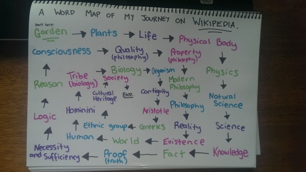
I know I’m behind, but that’s because I was convinced until now that I had to do my map and experiments based on the Foundations garden. Once I realised that wasn’t the case, I decided to go full speed ahead with mapping according to my interests.
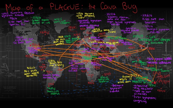
This particular experiment combines two of my favourite interests – gaming and diseases. Yes, it’s an odd combination. Allow me to explain.
The game ‘Plague Inc’ (designed by one-man game developer Ndemic Creations) is an apocalyptic game where the player creates and evolves a disease with the sole intent of destroying humanity. The aim of the game is to infect and kill every single human being on the planet, without first being eradicated by a cure. The game is challenging, strategic and above all, addictive.
I created this map through my own playthrough of the game. I took a stock image from Google Images that I thought would be appropriate, and opened it in Photoshop. As I progressed through the game, I would mark out where and when particular events would happen, using the in-game news reports and the game’s own time.
Here’s a quick profile of my disease:
Name: Cava Bug (yes, I named it after the class, CAVA101)
Disease Type: Bacteria
Origin: Australia
First Infection: 29/3/2014
First Symptom: Coughing
Transmission: Airbourne and waterbourne
I began by documenting which countries the bug travelled to, and which ones it infected. The blue dotted lines represent travel by boat, and the orange solid lines represent travel by plane. After a while, as my disease began to rapidly infect more countries, it became too hard for me to document them all, so I just recorded as many as I could in the first part of the game, before my disease went out of control. Each time another country was infected, I would pause the game and write the date of the infection. Each of the red dots and dates represent a new infection. They are all very scattered, so it’s a bit too hard to read them in chronological order. I recorded any new evolutions to my bug in purple, near the country where it first happened. Once my disease was spotted, I recorded anything to do with the cure effort in green. It was interesting to see which countries attempted to lead the cure effort, and which ones succeeded and failed. Although the cure effort began in Australia, where the disease originated, it was the UK that eventually took over and successfully found the cure. In the later stages of the game, when things started to get scary, I recorded particular dramatic events in yellow, such as government collapses and nuclear explosions.
The result here is a very complicated and chaotic map of how a disease affects the world.
I might try another one of these at a later date, and perhaps make it a bit more comprehensive. I had a lot of fun with this one, and am eager to try and win this time!